SUN ALL YEAR ROUND WITH THE TREND COLOR ORANGE
You can say a lot about orange, but it is certainly not a gray mouse. Orange stands for strength and positivity. And of course the color has a royal touch because of the royal family. In our interiors, the terracotta version has been the way to give the house a warm atmosphere and to keep the holiday vibe as long as possible for years. But what do you think of real orange? Do you dare to wear this trend color?
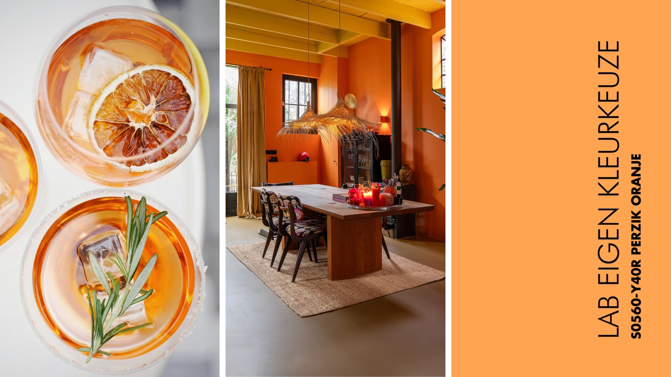
LAB Own colour choice S0560-Y40R (walls), LAB Interior paint Bumblebee no. 872 (ceiling), Pure Black no. 50 (woodwork) and LAB Floor coating Warm Tan no. 91. Photography: Lotte van Uittert. Interior: Pien Stieglitz.
THE SUN IN THE HOUSE
When you mix the energy of red and the cheerfulness of yellow, the sunny orange rolls out. The color is associated with sunshine, the tropics, enthusiasm, happiness and creativity. And where a red wall makes you restless or ensures that you are on edge 24/7, orange is mainly warm and homely. According to scientists, orange increases the oxygen supply to the brain, which makes you mentally stimulated, gives you a fresh head and, to top it all off, makes you more sociable and spontaneous. No need to say more , right? If you think it is still a bit too colorful for the living room, then it is certainly an idea for the study.
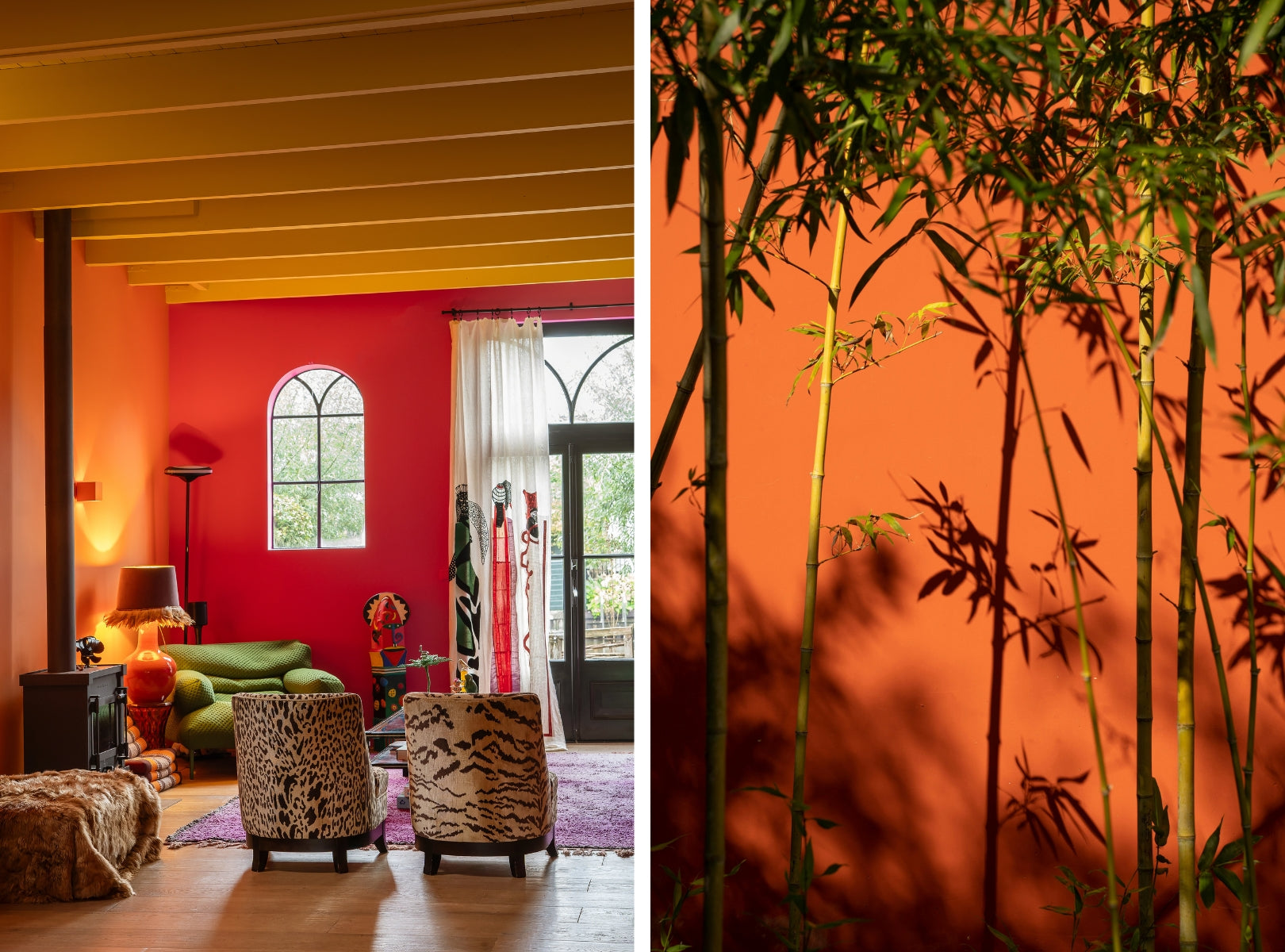
LAB Own colour choice S0560-Y40R NCS peach orange (left wall), S1060-R30B neon pink (right wall), LAB Interior paint Bumblebee no. 872 (ceiling) and Pure Black no. 50 (woodwork). Interior: Pien Stieglitz. Photography: Lotte van Uittert.
BETWEEN YELLOW AND RED
The painter Kandinsky once described orange as “red brought closer to humanity by yellow”. Orange - the colour created by mixing yellow and red - is an exciting and not so obvious choice for many people. Nevertheless, the power of orange is used extensively in logos of large companies and designers like to make statements with the not so common colour. In interiors, orange is mainly used as a contrast colour for the much more popular blue or in harmony with brown tones. Nevertheless, the colour also deserves to be in the foreground.
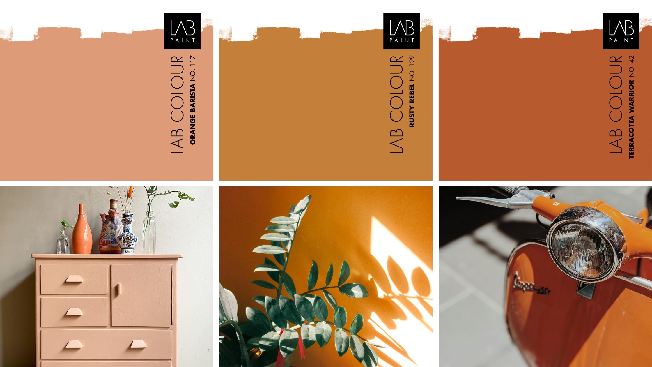
LAB COLOURS Orange Barista no. 117, Rusty Rebel no. 129 and Terracotta Warrior no. 42 (left to right). Cabinet: Pand 96.
BACK TO THE SEVENTIES
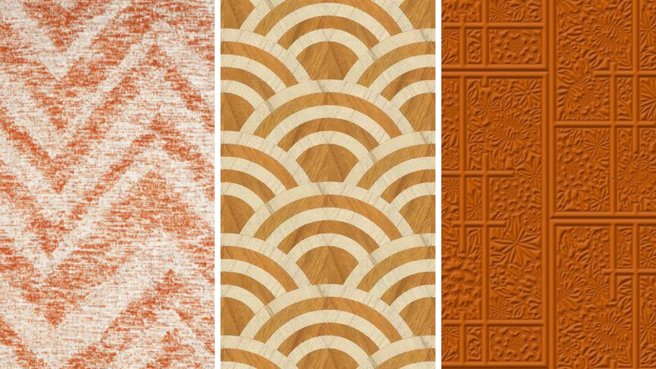
When you think of the seventies, you see two colours: brown and orange. Preferably in striking floral motifs and geometric shapes on wallpaper, fabrics and accessories. Completely in keeping with the free spirit of the time. And let's just say that we are in a major revival of that period.
Arte Cadance 47551 wallpaper (left), Arte Moooi Lucky O's MO3041 wallpaper (middle), Arte Moooi Shoji Blossom MO3032 wallpaper (right).
Shops with vintage and retro have been on the rise for years and that makes us appreciate the color orange more and more. Orange is also embraced in new furniture collections: beige is slowly making way for more color. And the cheerful orange cannot be missing.
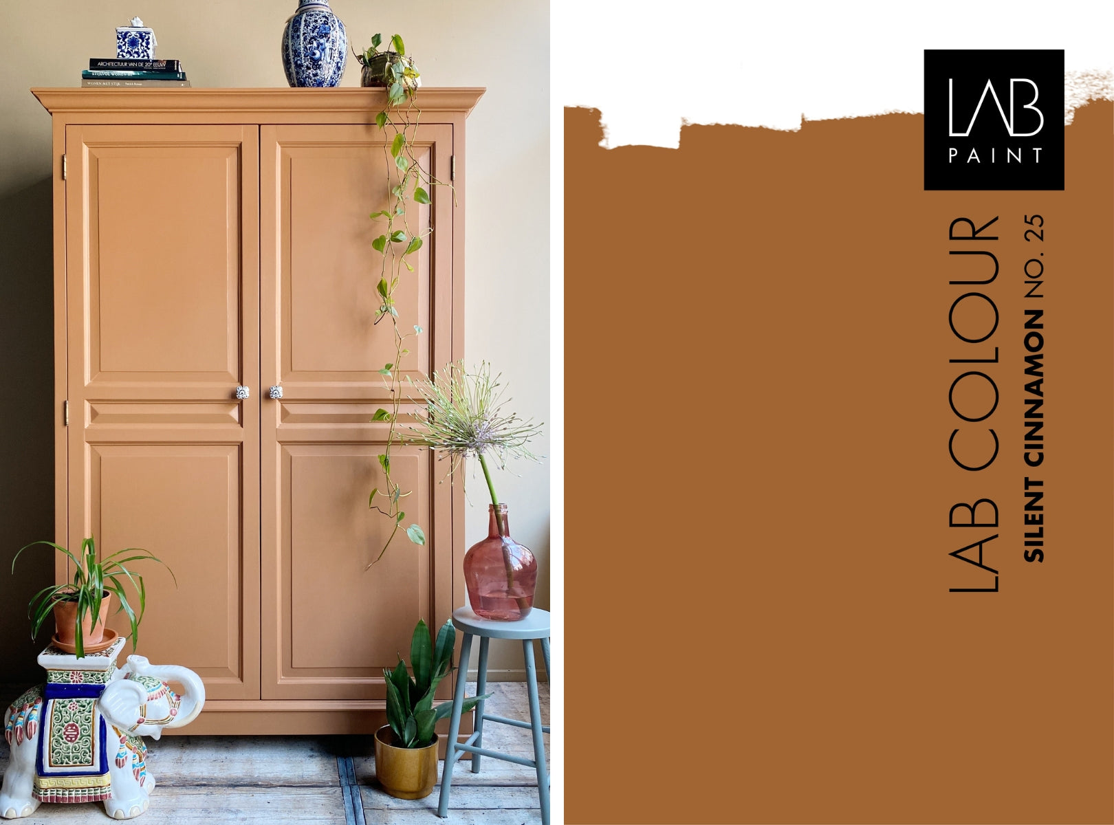
LAB Interior Paint Silent Cinnamon no. 25 (cabinet) and LAB Wallpaint Sensational Sand no. 290 (wall) (left). Cabinet: Pand 96. LAB COLOUR Silent Cinnamon no. 25 (right).
ORANGE AS CONTRAST OR TONAL
When you look at Itten's color wheel , you see that orange is directly opposite the color blue. These colors are often combined with each other, because they bring out the best in each other. Orange brings out the coolness in blue tones and blue makes orange just a little less bright. Best buddies .
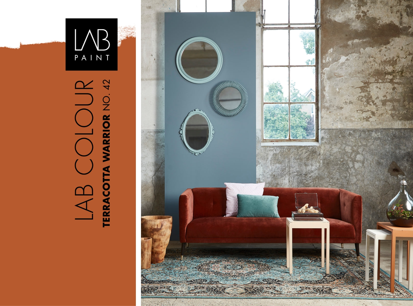
LAB COLOUR Terracotta Warrior no. 42 (left). LAB Wallpaint Smokey Eyes no. 47 (panel) and LAB Binnenlak Stunning View no. 32 (mirrors), Masala Chai no. 31, Strong Garlic no. 92 and Silent Cinnamon no. 25 (side tables)(right). Photography: Muk van Lil.
If you prefer not to have big contrasts in your interior, you can also use orange in different shades, or ton sur ton. In harmony with brown or yellow, orange is also at its best.
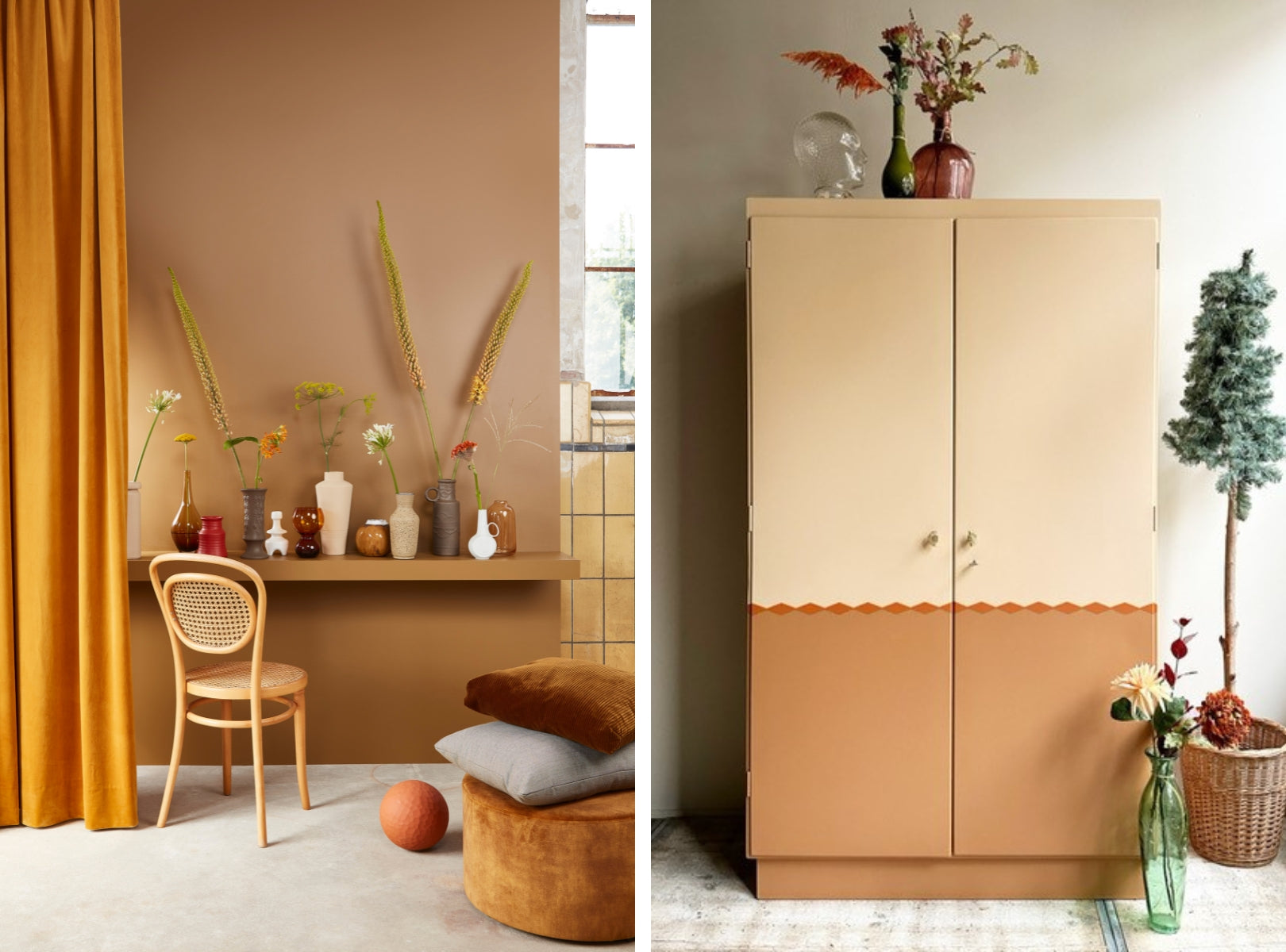
LAB Wallpaint Warm Tan no. 91 (wall) and LAB Indoor paint Sensational Sand no. 290, Dark Taupe no. 196, Terracotta Warrior no. 42 (vases) (left). Photography: Muk van lil. LAB Wallpaint Fluffy Cheetah no. 255 (wall) and LAB Indoor paint Teddy no. 518, Terracotta Warrior no. 42, Silent Cinnamon no. 25 (cabinet, top to bottom) (right). Cabinet: Pand 96.
LIGHT ON ORANGE
Another advantage of orange: the colour actually comes into its own in all rooms. Whether the room is facing north, south, east or west. Sometimes you have to be careful with the incidence of light when it comes to colours , but orange can actually give a room with cool light from the north more warmth. In a room facing east or west, you would do well to use a lighter shade of orange. If the sun shines brightly all day long, you should be careful with bright orange: bright shades can sometimes come across as a bit too intense in the south. Test the effect of orange in advance with colour samples or create a colour area with our sample pots , that can prevent possible disappointments.
LOOK FOR IT IN NUANCES
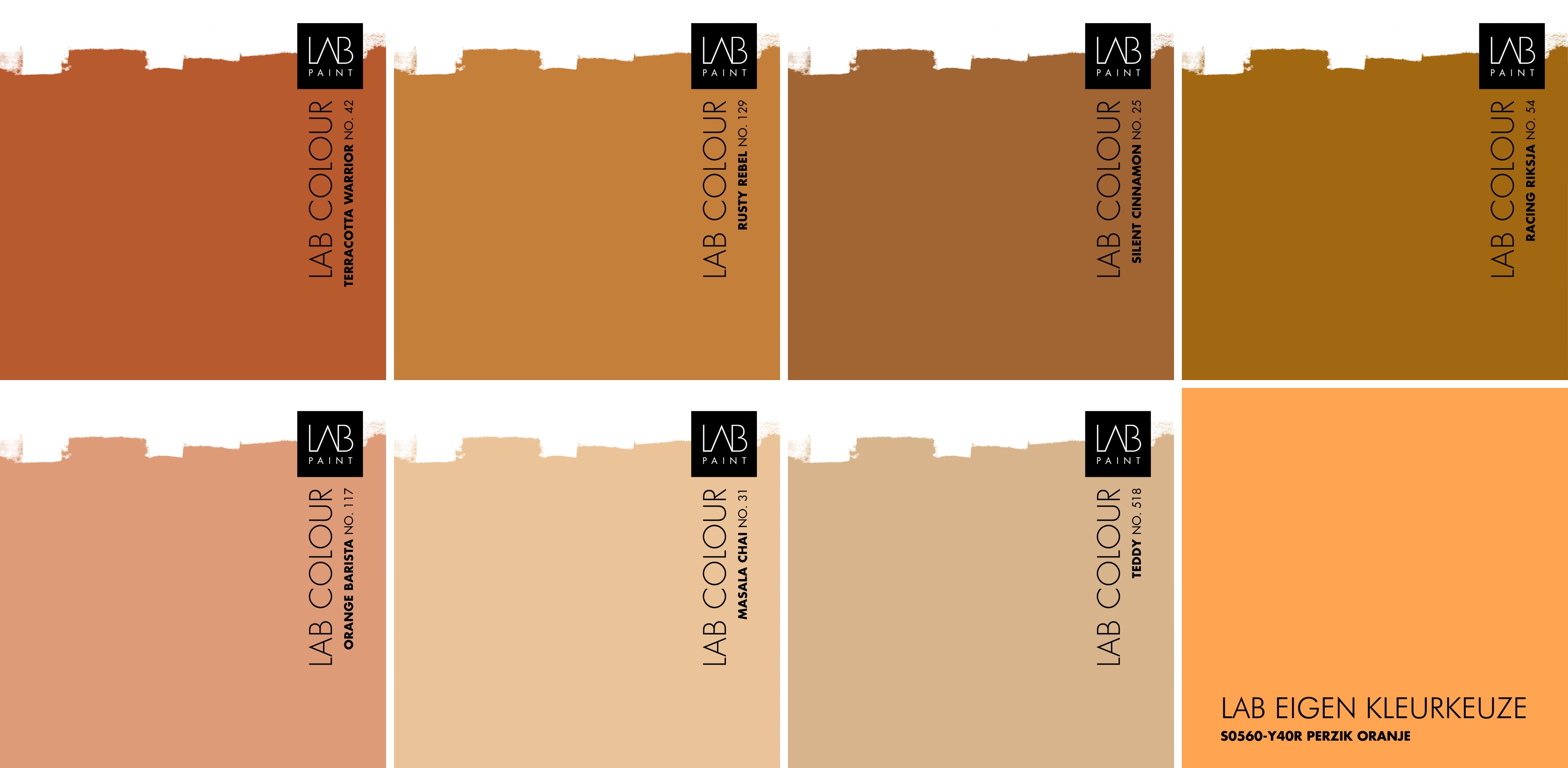
When you think of orange, you might think of the bright orange decorations on King's Day, but the color comes in many shades. If your home could use a bit more warmth or contrast, it could also be a grayish orange, salmon color, terracotta or rust color. Just look at these orange shades from the LAB COLOURS collection:
ORANGE ABOVE
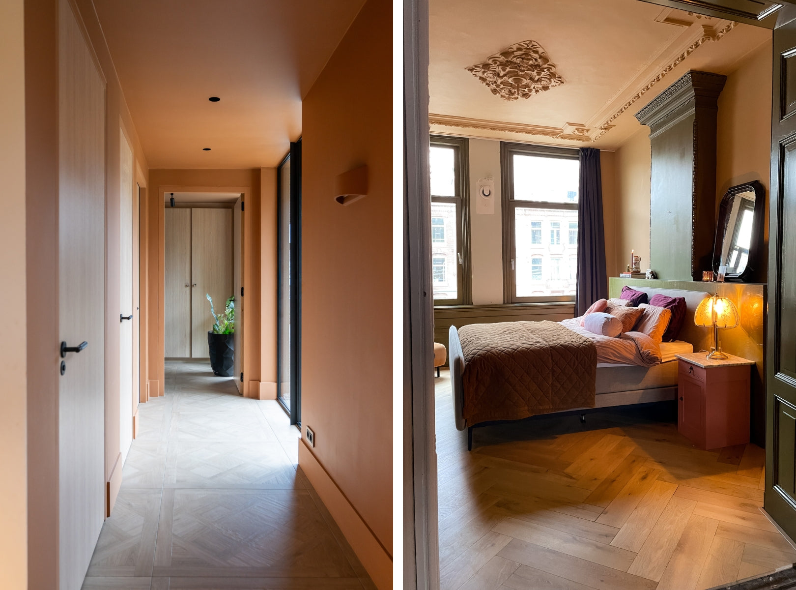
Orange on the walls? Then it is not a bad idea to include the ceiling as well. This prevents the contrast between orange walls and a white ceiling from being too great, but it also provides unity, security and - although that may sound strange with orange - peace. Just look at the interior of Kim Kötter . And in combination with dark window frames, orange fits in a more classic interior style, such as with Doortje Kruisheer.
LAB Wallpaint and LAB Interior paint Silent Cinnamon no. 25 (walls, ceiling and woodwork) (left). Interior: Kim Kötter. LAB Wallpaint and LAB Interior paint Hunter no. 192 (woodwork and mantelpiece), LAB Wallpaint Teddy no. 518 (walls and ceiling) (right). Interior: Doortje Kruisheer. Photography: Lotte van Uittert.
Finally, a bonus tip: white light switches can also be an eyesore on a colored wall. Therefore, paint the wall sockets and light switches in the orange wall color. Note: first degrease and wipe with LAB paint cleaner, then apply LAB Multiprimer (1 layer), and then paint with LAB Interior Paint (2 layers).
You see: orange can be used more than one day a year.
SHOP THE ORANGE LOOK
Let your creativity run wild and create a colourful interior that you can come home to. Are you excited and do you want to try out your orange shade first? Use our LAB Sample pots and test your orange directly on the wall or a sheet of paper. Discover how the colour works out in your home :
- Sample pot Terracotta Warrior no. 42
- Sample jar Rusty Rebel no. 129
- Sample jar Silent Cinnamon no. 25
- Sample game Racing Rickshaw no. 54
- Sample jar Orange Barista no. 117
- Sample jar Masala Chai no. 31
- Sample jar Teddy no. 518
- LAB Own color choice S0560-Y40R (peach orange)
Can be beautifully combined with the previously mentioned orange wallpaper:
- Wallpaper sample Arte Cadance 47551
- Wallpaper sample Arte Moooi Lucky O's MO3041
- Wallpaper sample Arte Moooi Shoji Blossom MO3032
Curious for even more inspiration?
READ ALSO:



Leave a comment