SPOTTED IN VTWONEN NO. 03 2023: LAB PAINT AND PURE & ORIGINAL IN GREEN SHADES
Green is a versatile and popular color, with which you can add a fresh and natural look to your interior. Whether you are a plant lover or just love the soothing atmosphere that green can create. There are countless ways to integrate this color into your home. In Vtwonen no. 03 2023 you can see how interior stylist Marianne Luning has applied different shades of green with, among others, LAB PAINT and Pure & Original.
From various ideas and tips to use this colour in a stylish and harmonious way to combining multiple shades of green and materials.
Here LAB Wallpaint in the shade Poetic Pondicherry no. 58 is used. Poetic Pondicherry no. 58 has a slightly grayish undertone, which allows you to make the link with sage. Definitely a green shade, but warm, because this color shade already creeps quite a bit towards the yellow tones. Surprisingly rhyme Poetic Pondicherry no. 58 with Pink Peach no. 24 and Copperhead no. 29. This way you ensure a nice, consistent meter.
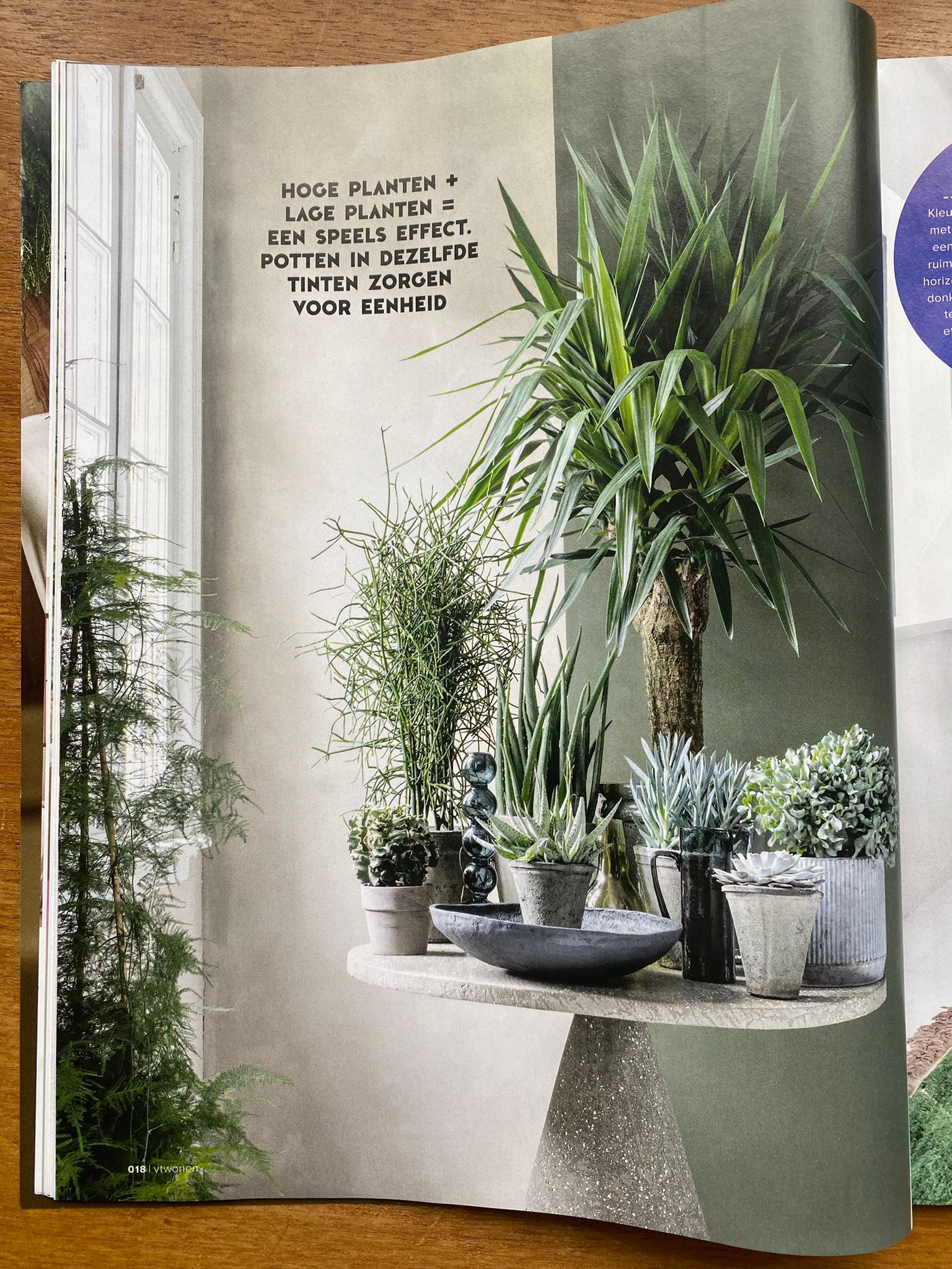
For a playful effect, choose Fresco in Sand Storm by Pure & Original (left) and LAB Wallpaint in Intensive Moss no. 76 (right). Intensive Moss no. 76 is a deep, almost velvety green. Like the moss growing against tree bark. Intensive Moss no. 76 is a finely weighted green tone that creeps into a deep olive shade through the addition of yellow. Just Jimmy no. 559 is beautiful as a light base for Intensive Moss no. 76 .
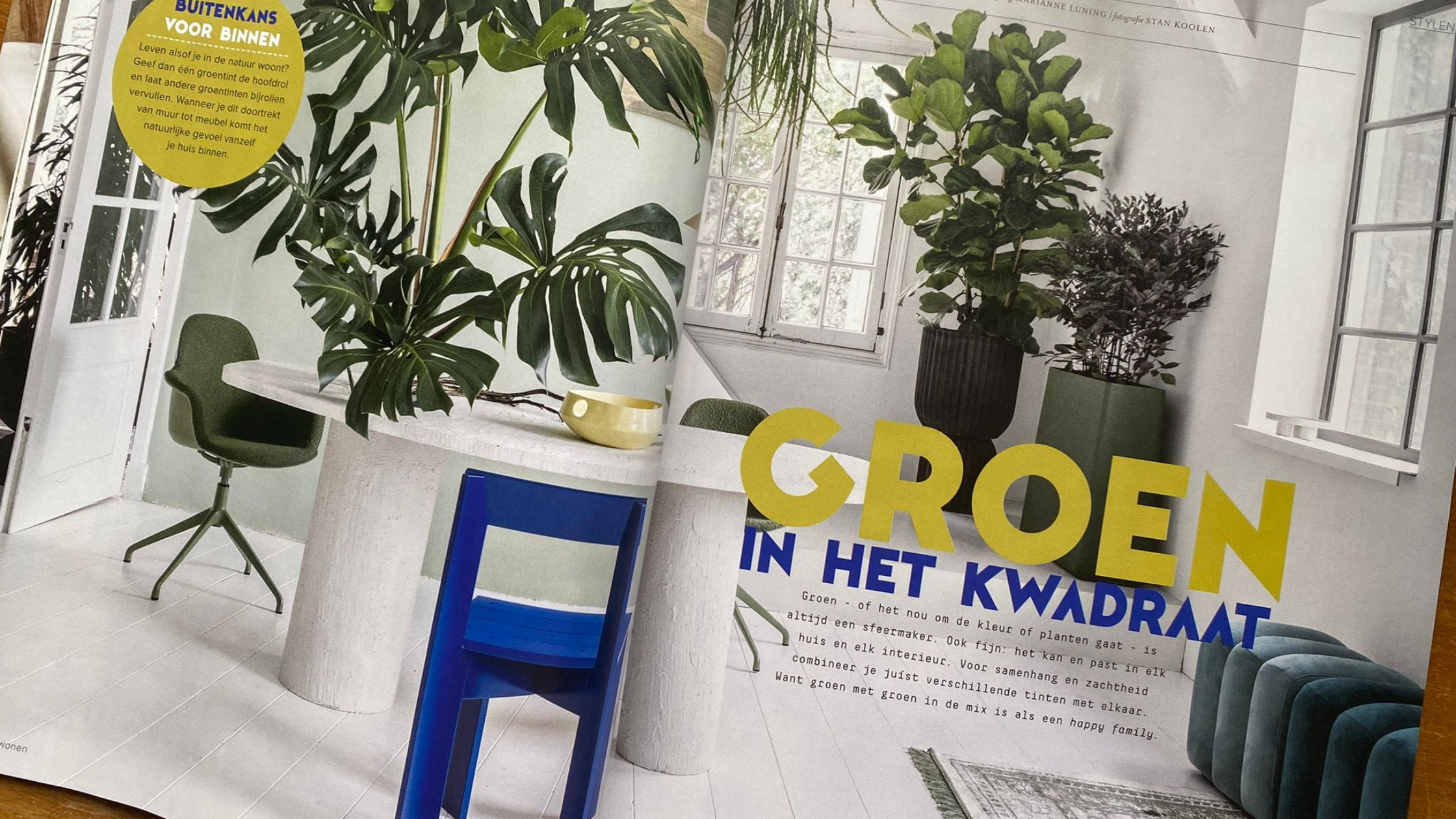
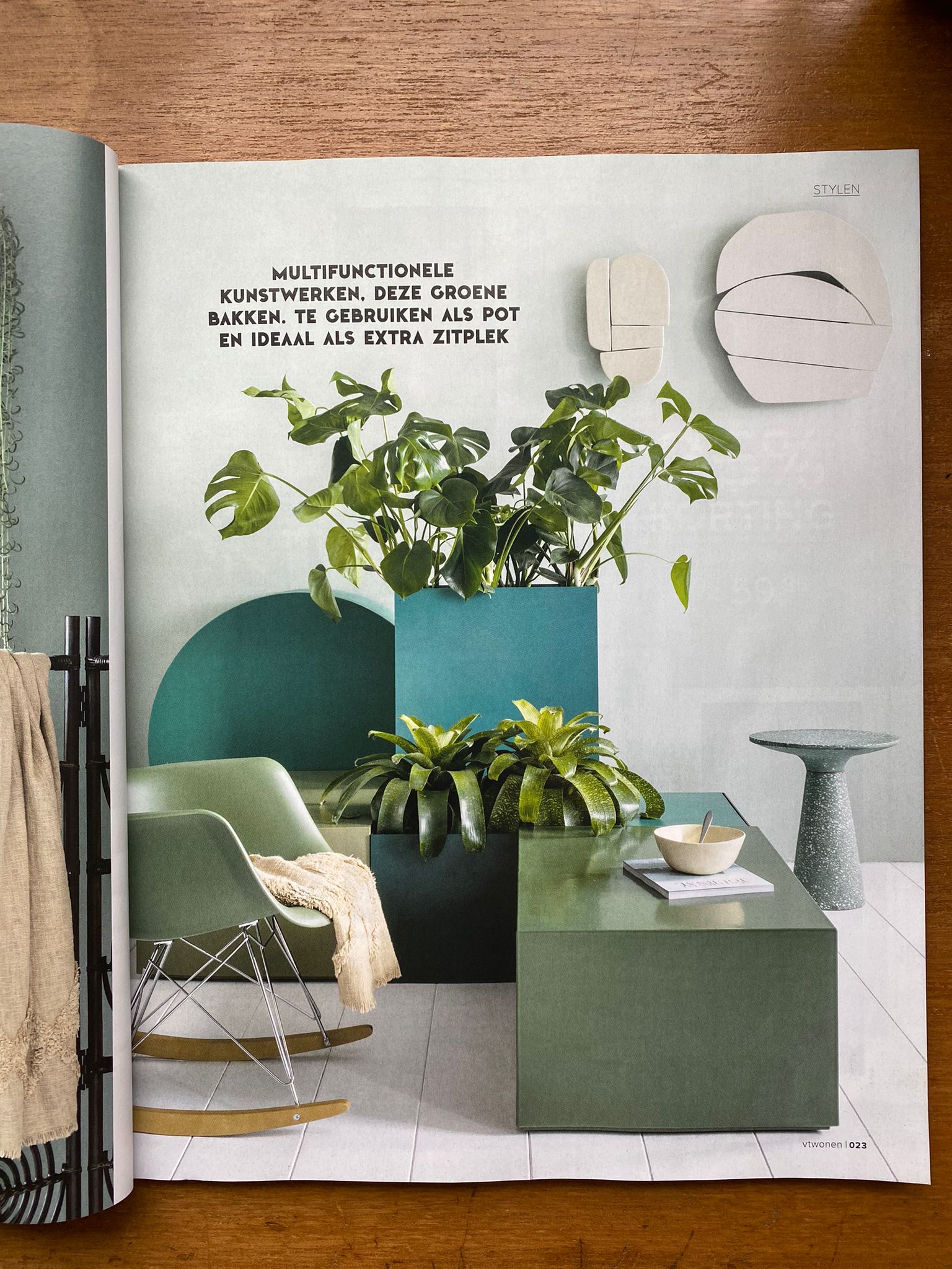
Or do you prefer colour areas? Colour areas are real eye-catchers. Marianne Luning has applied LAB Wallpaint in the shade Intensive Moss no. 76 to the dark area and Moss no. 41 to the light area. Bring nature into your home and blur the boundaries between inside and outside. Moss no. 41 is a beautiful moss green with which you can create an oasis of peace and privacy. Do you want to add a bit more energy? Then Moss no. 41, with its yellow undertone, goes beautifully with Ginger no. 260 and Fabulous Saffron no. 446 .

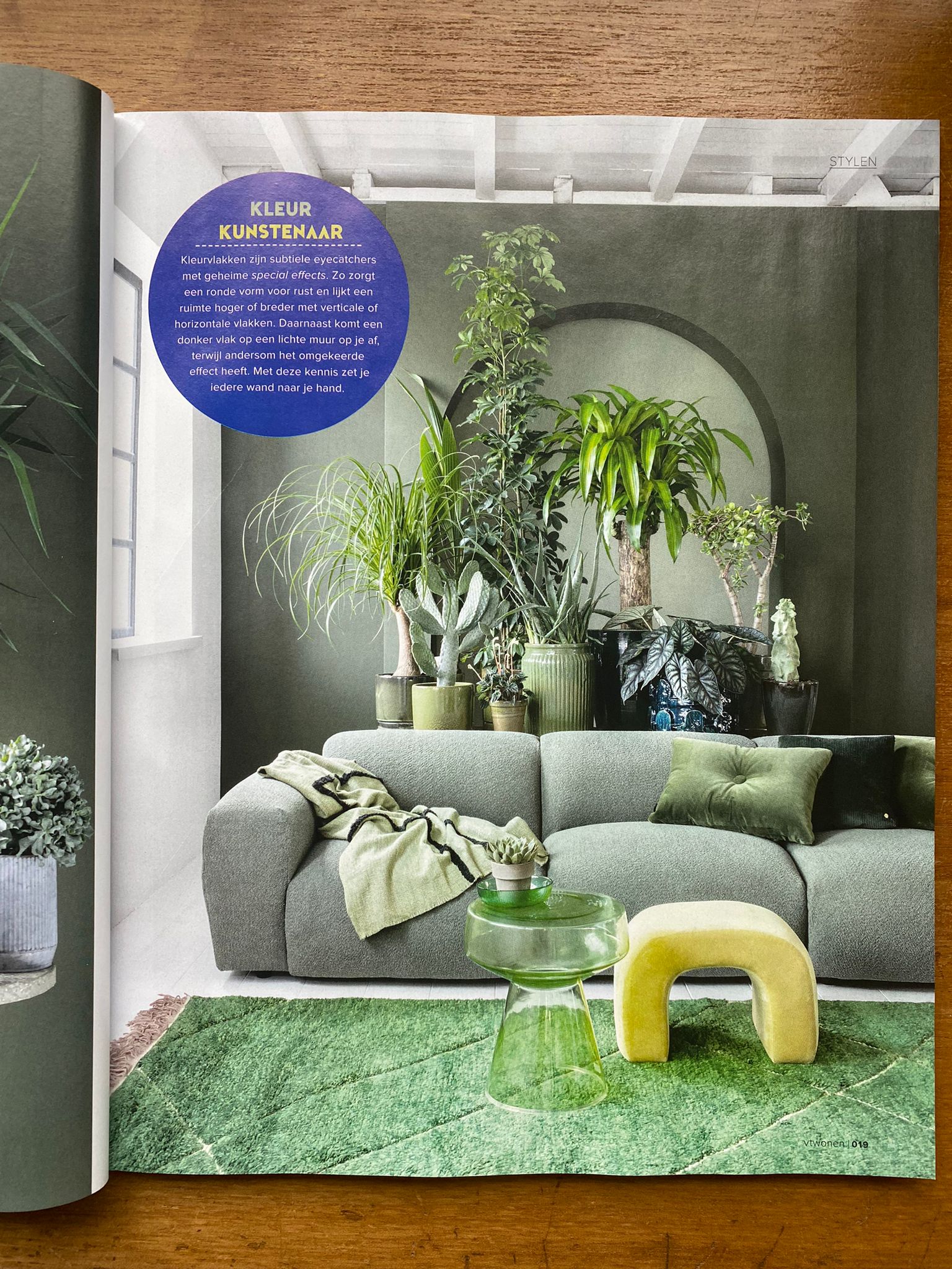
In this “moving still life,” Pure & Original’s Sand Storm in Fresco serves as the backdrop. Fresco is a paint known for its distinctive look. It has a matte, chalky finish that adds a subtle texture to any surface it’s applied to. Pure & Original’s Sand Storm has a warm undertone that enhances the sense of coziness and comfort in a space.
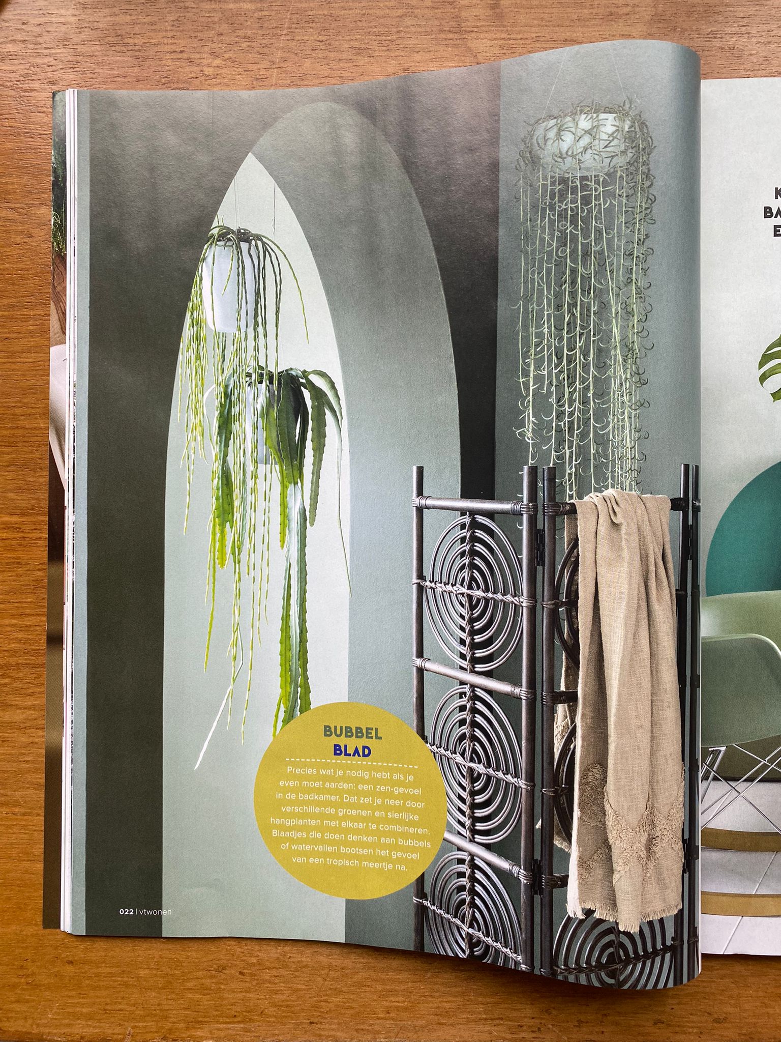
Combine different greens and create a zen feeling. The counter is again painted with LAB Wallpaint in the shade Intensive Moss no. 76 , the lighter green shade is Whispering Woods no. 62. This green is literally whisper-soft. Like nature in autumn, when the bright colours of the green have softened. Whispering Woods no. 62 is subdued by a beautiful greying and warm by the addition of light yellow. Sublime with various types of wood and soft natural nuances, such as Just Jimmy no. 559 and White Wood no. 201 .
Try out a colour? Then use the LAB Sample pots and/or Pure & Original Colour Sample . With the sample pots and colour samples you can test your LAB COLOUR or Pure & Original shade directly on the wall and discover how the colour turns out in your home.
Are you hesitating between multiple colours? Then also order the free LAB Colourcard and/or Pure & Original Colourcard .