

DESCRIPTION
Little Greene Colour Chart Colours of England & Colour Scales
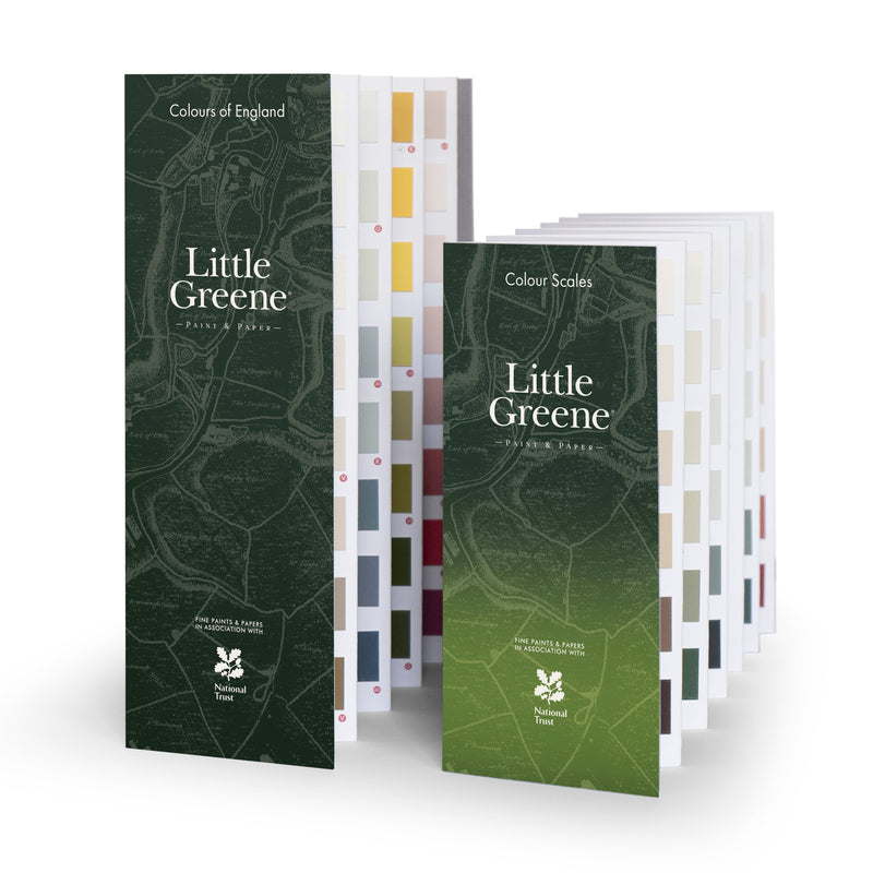
Little Greene presents two new colour cards: the refreshed and refined ‘Colours of England’ colour collection and an expanded range of graduated shades in the new ‘Colour Scales’ range. The colour cards have been reformatted and presented together in one pack. The refreshed palette of 196 Little Greene colours brings together the best of all previous capsule collections and is designed to make choosing paint colours enjoyable and intuitive. With a belief in colour at the heart of Little Greene’s ethos, the refreshed ‘Colours of England’ and ‘Colour Scales’ colour cards span 300 years of historic interior design. Both feature numerous authentic shades from the 18th, 19th and 20th centuries. These historic colours are presented alongside a carefully revised palette of contemporary shades, embracing the aesthetics of modern interior design and current decorating trends.
Colours of England
The new ‘Colours of England’ colour card has been updated to meet the growing demand for classic, timeless colours that are both easy to choose and pleasant to the touch. The collection features many meaningful shades, sourced from all corners of the UK, which have contributed to the internationally renowned ‘English Interior Design’ style.
Colour Scales
The extended ‘Colour Scales’ card features eight families of progressively graded iconic Little Greene colours, as well as the ‘Stone’ and ‘Grey’ capsule collections. This colour card answers the need for easy-to-create colour schemes, offering harmonious and monochromatic decors for decorations. The new Colour Scales colour card has an easy-to-use design. In addition to the ever-popular neutral shades, the card also includes deeper colours, which identify the undertone of each colour family. Each shade belongs to a graduated colour family and is grouped into a column according to its undertone. Each colour family therefore has its own column. The tonal shades within the same column can be combined harmoniously or a balanced contrast can be created by combining colours from different columns.
Forty of the most popular shades are included in both color charts, giving customers the opportunity to see these exceptional shades in different color environments, showing how these shades work in a coordinating and harmonious way, or in a dynamic and diverse way.
Want to see more from Little Greene?
Little Greene Colour Chart Colours of England & Colour Scales
Little Greene presents two new colour cards: the refreshed and refined ‘Colours of England’ colour collection and an expanded range of graduated shades in the new ‘Colour Scales’ range. The colour cards have been reformatted and presented together in one pack. The refreshed palette of 196 Little Greene colours brings together the best of all previous capsule collections and is designed to make choosing paint colours enjoyable and intuitive. With a belief in colour at the heart of Little Greene’s ethos, the refreshed ‘Colours of England’ and ‘Colour Scales’ colour cards span 300 years of historic interior design. Both feature numerous authentic shades from the 18th, 19th and 20th centuries. These historic colours are presented alongside a carefully revised palette of contemporary shades, embracing the aesthetics of modern interior design and current decorating trends.
Colours of England
The new ‘Colours of England’ colour card has been updated to meet the growing demand for classic, timeless colours that are both easy to choose and pleasant to the touch. The collection features many meaningful shades, sourced from all corners of the UK, which have contributed to the internationally renowned ‘English Interior Design’ style.
Colour Scales
The extended ‘Colour Scales’ card features eight families of progressively graded iconic Little Greene colours, as well as the ‘Stone’ and ‘Grey’ capsule collections. This colour card answers the need for easy-to-create colour schemes, offering harmonious and monochromatic decors for decorations. The new Colour Scales colour card has an easy-to-use design. In addition to the ever-popular neutral shades, the card also includes deeper colours, which identify the undertone of each colour family. Each shade belongs to a graduated colour family and is grouped into a column according to its undertone. Each colour family therefore has its own column. The tonal shades within the same column can be combined harmoniously or a balanced contrast can be created by combining colours from different columns.
Forty of the most popular shades are included in both color charts, giving customers the opportunity to see these exceptional shades in different color environments, showing how these shades work in a coordinating and harmonious way, or in a dynamic and diverse way.


