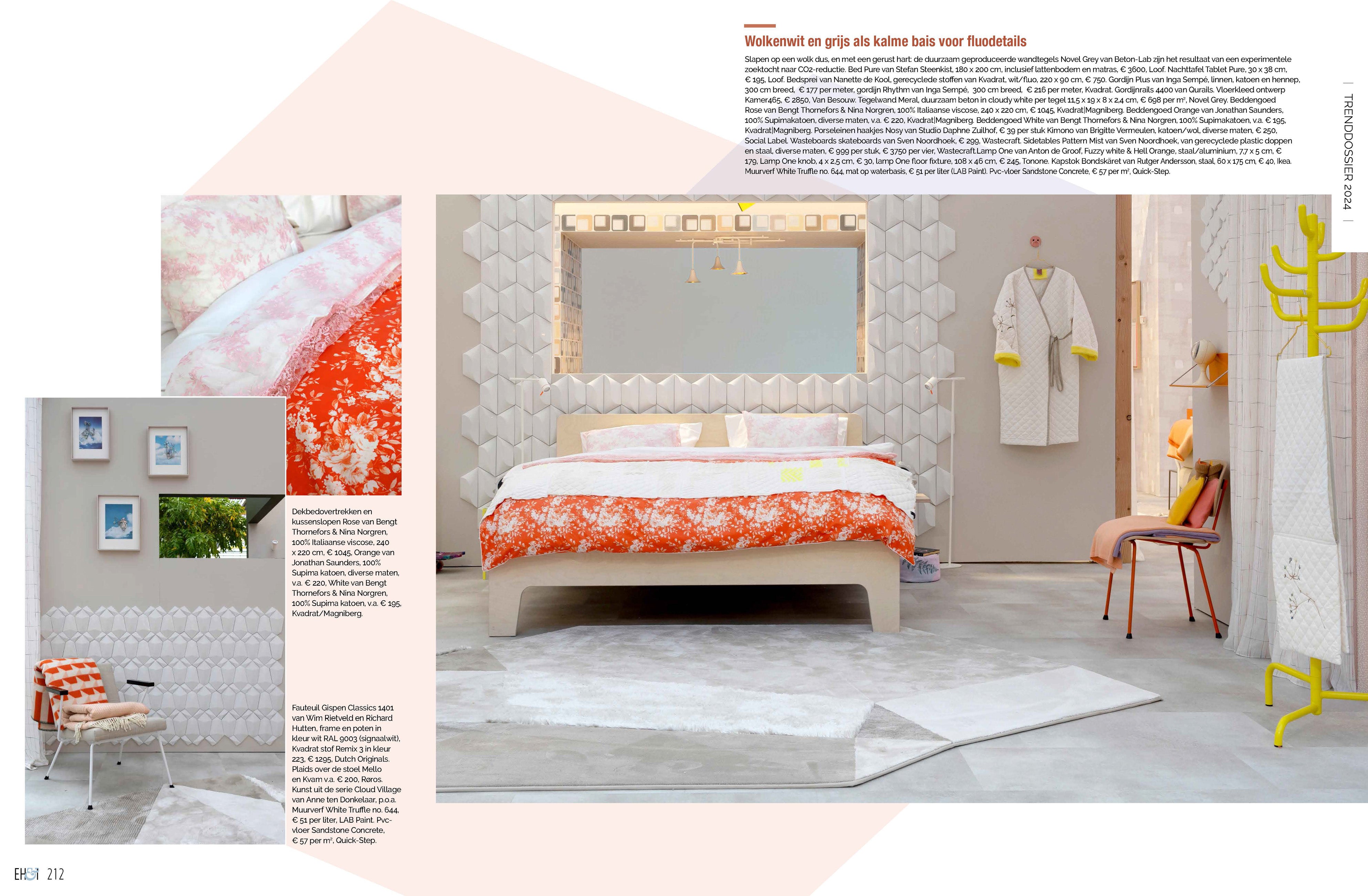
SPOTTED IN YOUR OWN HOME & INTERIOR NO. 6, TREND FILE 2024: THE SUNNY AND SUSTAINABLE EH&I TREND PAVILION
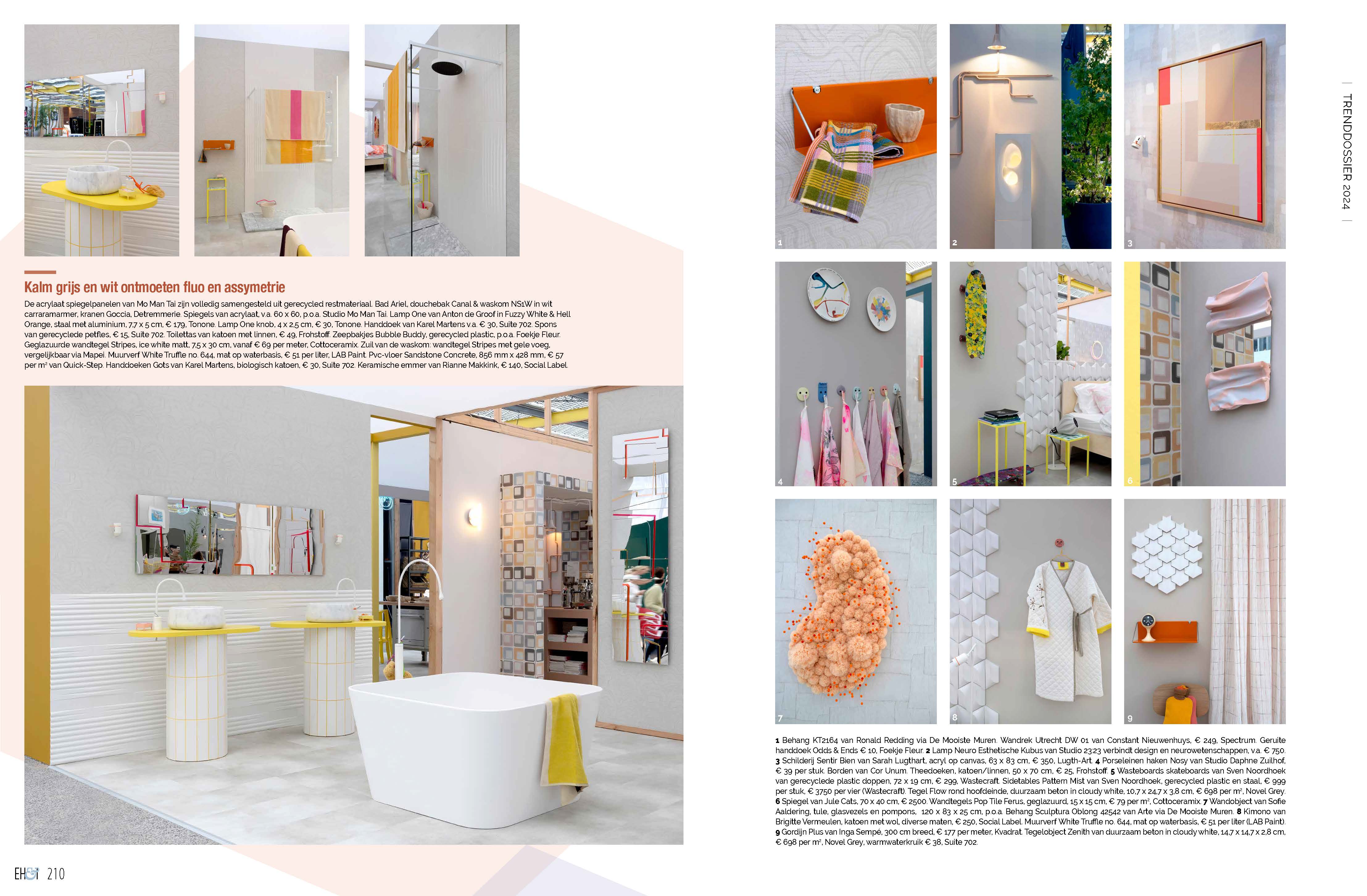
In Eigen Huis & Interieur number 6, the Trend Dossier of 2024 looks ahead to what we can expect in the field of interior and design. The Trend Pavilion of EH&I at the Vtwonen and design fair 2023, painted entirely in LAB PAINT, has been partly reused and is therefore the sustainable representation of cheerful minimalism to post-brutalism. Anya van de Wetering and Marie-Claire Lambalk of concept and styling agency Kamer 465 designed the partly reused pavilion, which looks completely new. Not only because of the completely different layout, but also because of the LAB COLOURS used.
Curious how you can apply these LAB COLOURS in your interior? Then read on quickly to find out how you can create an interior with a combination of expressive and colourful on the outside and subdued with a colourful edge on the inside.
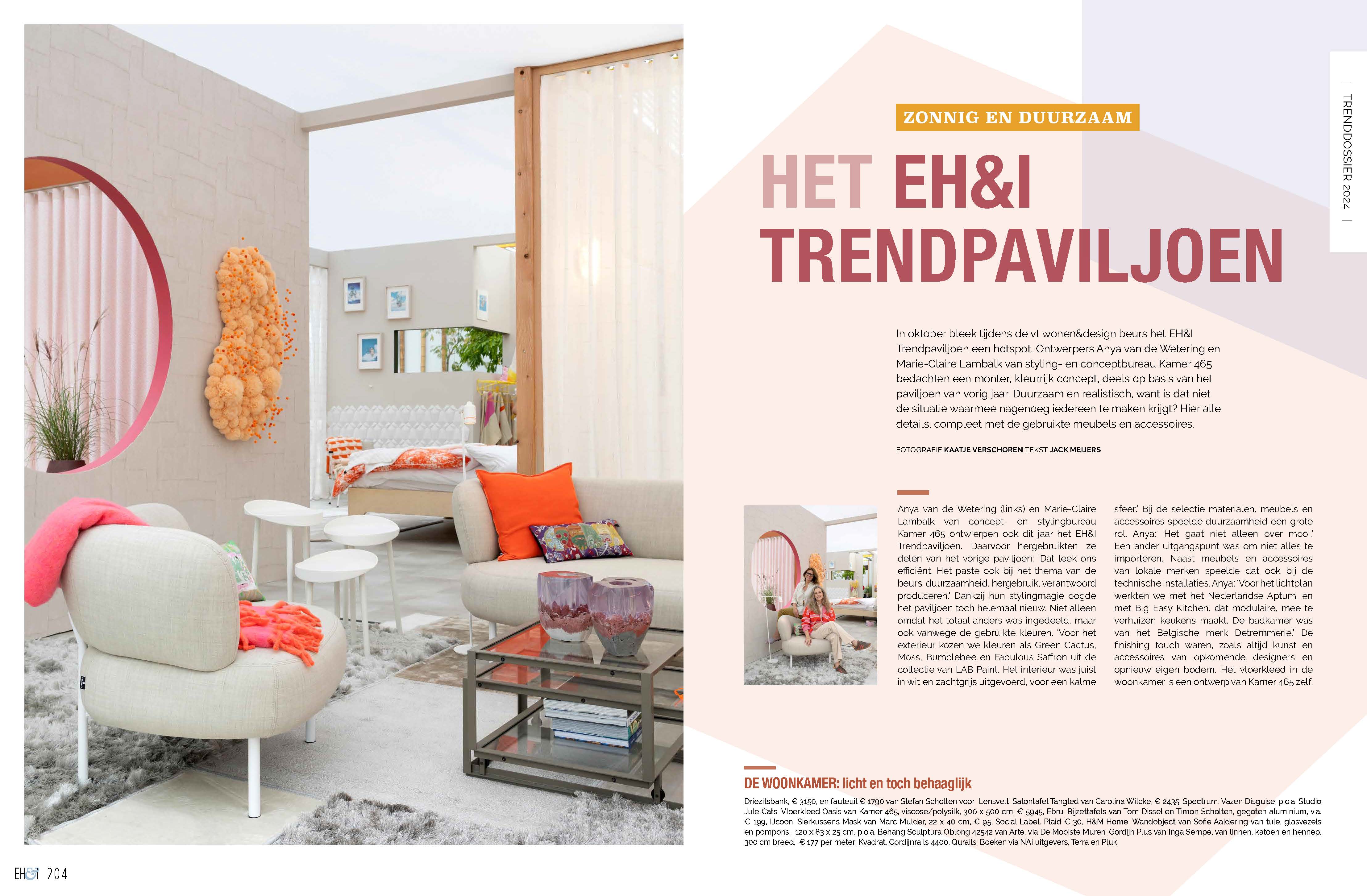
Shades of gray as a base
In Between no. 672 is somewhere between pale white and pearl grey and has a hint of mauve. A grey but not quite. White Truffle no. 644 is a light beige with a brown-grey undertone; a typical greige. The calm grey tones ensure a smooth transition between all the different living areas. Where each space mainly radiates peace and security. The place to escape from all the hustle and bustle. A house to relax.
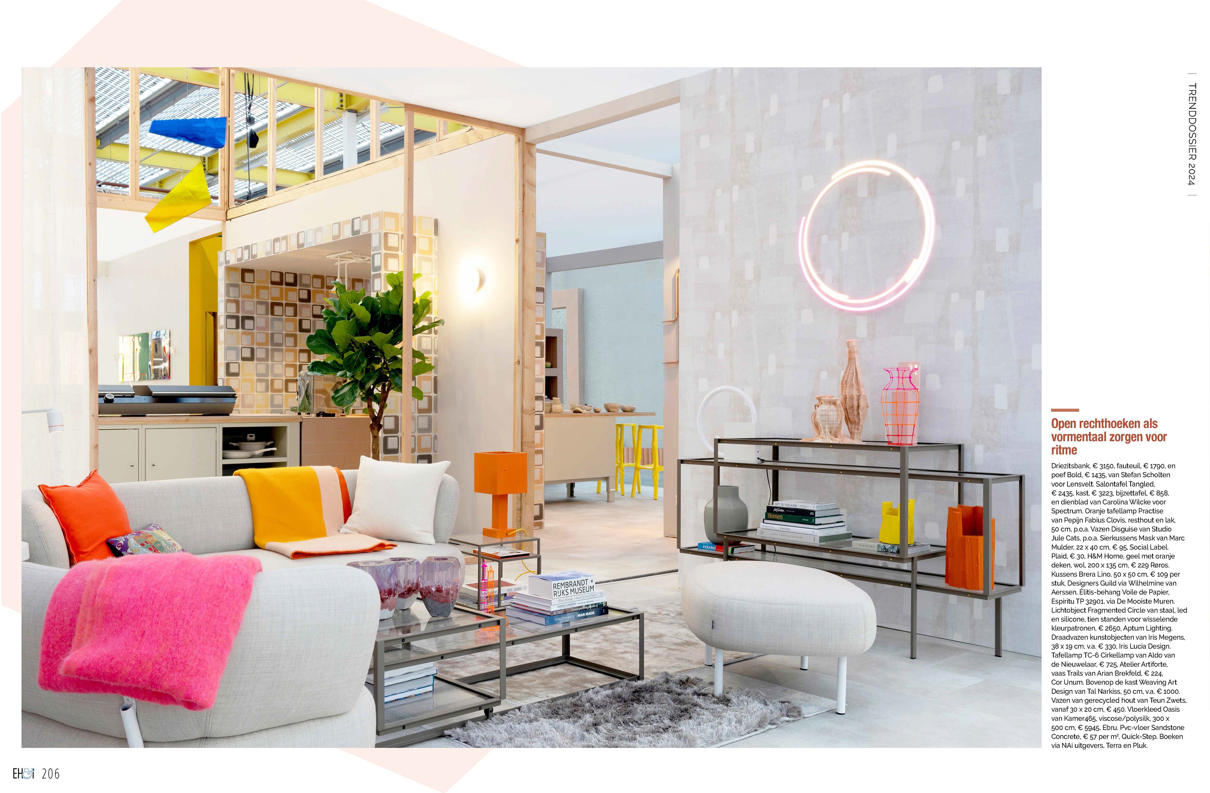
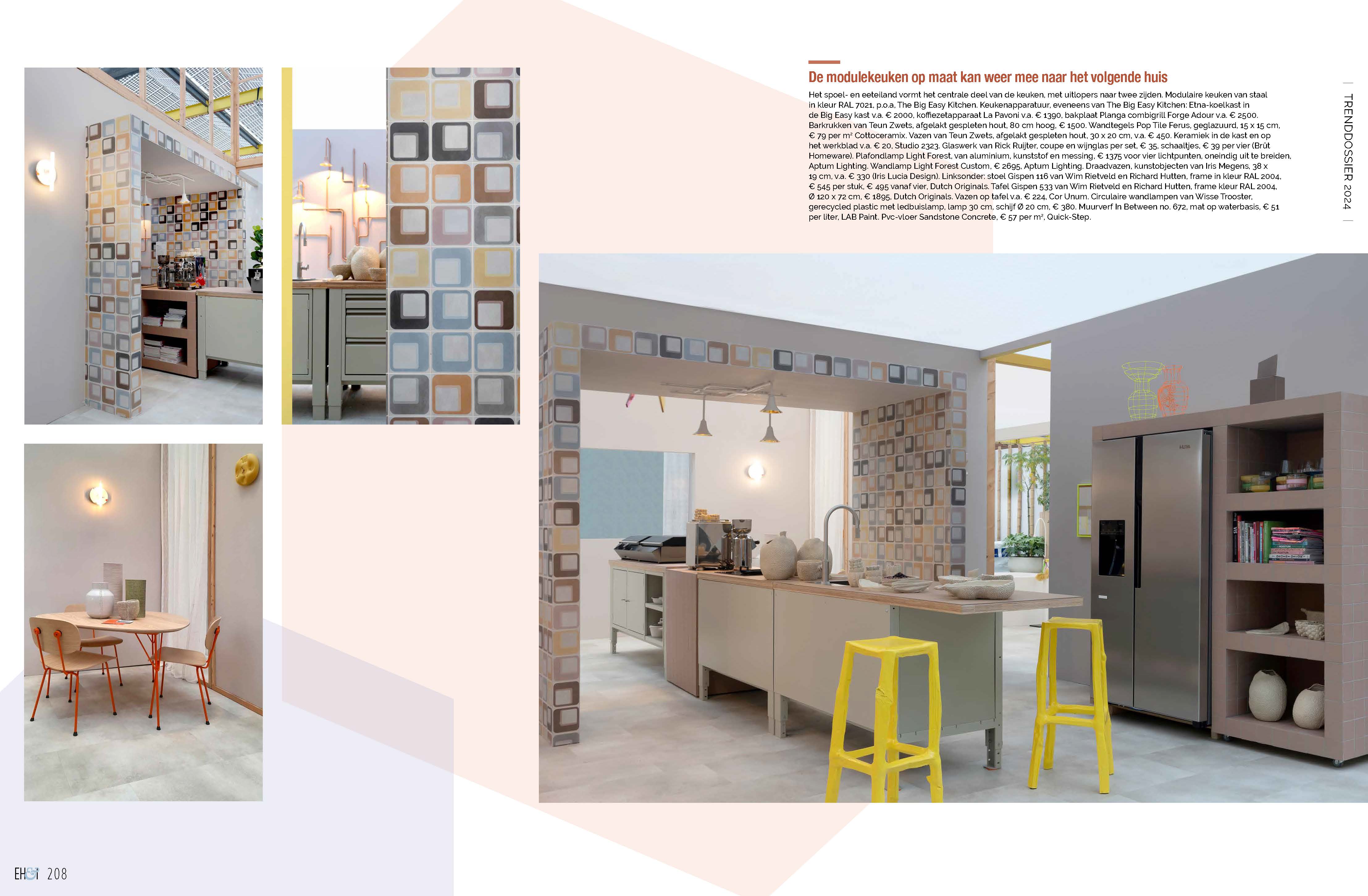
Make it personal
By adding personal items and an expressive colour here and there, you finish off the rooms. Let a selection of such shades recur throughout the house. The trick is not to overdo it. These accents make the difference between boring or calm.
Contrast between inside and outside
There is a great contrast between inside and outside. The low-maintenance garden is full of colour. Every corner of the garden is decorated in its own way. Expressive colours are combined, such as the exuberant pink Oh My Gosh no. 779 with the charismatic orange Terracotta Warrior no. 42. This combination creates a refreshing, yet earthy atmosphere.
Another daring combination is Bumblebee no. 872 with Fabulous Saffron no. 446 . With the refreshing honey yellow shade with a hint of ochre and the ultimate and powerful ochre you transform your exterior into the feeling of a beautiful spring. Also the interplay of the blue shades Medina no. 573 and Monaco Moon no. 181 and the green shades Moss no. 41 and Green Cactus no. 12 provide a surprising look and feel. Every garden corner has something extra to do or see and that makes it complete.

Want to try LAB COLOURS?
Want to try out one or more of the described LAB COLOURS? Order a LAB Sample pot to test the colour directly on the wall or a sheet of paper and discover how the colour works out in your home. Order the sample pots via here.
With thanks to Marie-Claire Lambalk and Anya van de Wetering from concept and styling agency Kamer 465, Aptum Lighting, Cottoceramix, De Mooiste Muren, Detremmerie, Dutch Originals, Ebru, The Garden store, Kvadrat, Lensvelt, Loof, Mo Man Tai, Net echt, Novel Grey, Quickstep, Spectrum, The Big Easy Kitchen, Tonone, Van Besouw and Wisse Trooster.


